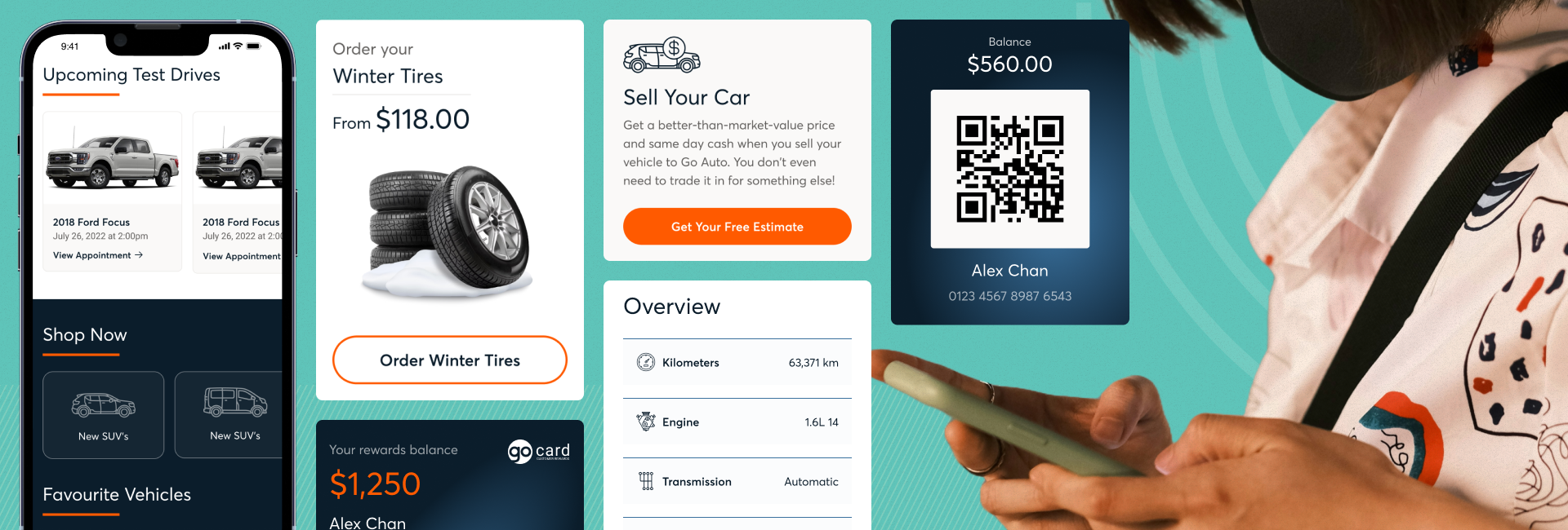
Case Study
Designing Great Customer Experience with Go Auto
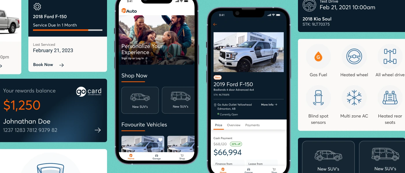
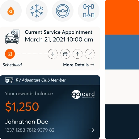
Go Auto recently went through a brand refresh—and along with it, an update to their design system. The new design system was designed with the website in mind, but was not completely ideal for the mobile app experience. We worked collaboratively with Go Auto to adapt their new design system for mobile and improve the overall experience for the customer.


Client

Services
UX/UI, Custom development
Platforms
Mobile Application for iOS and Android


The Overview
Just like software, design systems are never done. They need to be refreshed and improved as user habits and platforms change.
A design system is a collection of elements that give us common patterns to maintain consistency in a digital product experience with as little friction as possible. They help users navigate a digital platform more easily, but with the type of result the product owner was hoping to achieve—like setting up an account, performing a search, or filling out a form.
Our partnership with Go Auto goes back many years, and is one we truly value. Over time, we have changed the way we work together—from outcome-focused projects to a flex team, where we augment Go Auto’s existing digital product team with folks of our own so that we can help them release features and products faster.
In July 2022, the Go Auto mobile app was officially launched. Since then, we have been working with them to regularly release updates and features. Recently, ahead of a major national advertising campaign with NHL star Connor McDavid, Go Auto decided to do a company-wide brand refresh that would impact their website and mobile app.
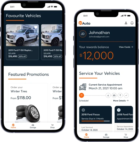
The new design system is great for the user, but it came with a few challenges—namely that it wasn’t adapted for mobile applications, just for web. We had to figure out how to adapt the design system for mobile, without delaying our existing release schedule or the final roll out date for the brand refresh.
We developed the following problem statement:
Incorporating Go Auto’s brand refresh and new design system into an existing mobile app will take time to adapt and deliver. How might we quickly update the app in a way that enables customers to have a cohesive and optimized brand experience, while giving ourselves space to deliver the other outcomes we’ve committed to?


The Solution
The new design system added something new to our work schedule but didn’t come with any additional resource or time availability. So, to tackle this properly, we did what we felt would be the most valuable use of time—we paused, and made a plan.
Our solution was to break down the changes based on the most noticeable global changes and the most impactful screens first, so that the overall look and feel of the app appeared cohesive, even through an iterative set of releases.
- We did an audit of the current app to see which components we were already using.
- We prioritized the global changes that had the biggest impact and took the least amount of effort.
- Then we prioritized the most widely used screens, and those that had the highest impact in the app.
- We gradually implemented the remaining rebranded components and screens in stages until everything was rebranded.
Approaching the project this way also allowed us to maintain our current development schedule and app releases.

The Outcome

Successfully merged design systems and maintained usability and expectation for the user.

Continued to release features and functionality on a regular basis while rolling out the new design system.

Made the user experience on mobile as frictionless as on web.

“Taking the time to come up with a solid game plan was pivotal to the successful implementation of this re-brand.”
Breanne Dagenais
UX/UI Designer


